

Why Everyone Is Talking About the Harry Potter Trailer's Color (And What It Means for Your Film)
Most filmmakers don't realize they're setting up the same problem before they even hire a colorist.

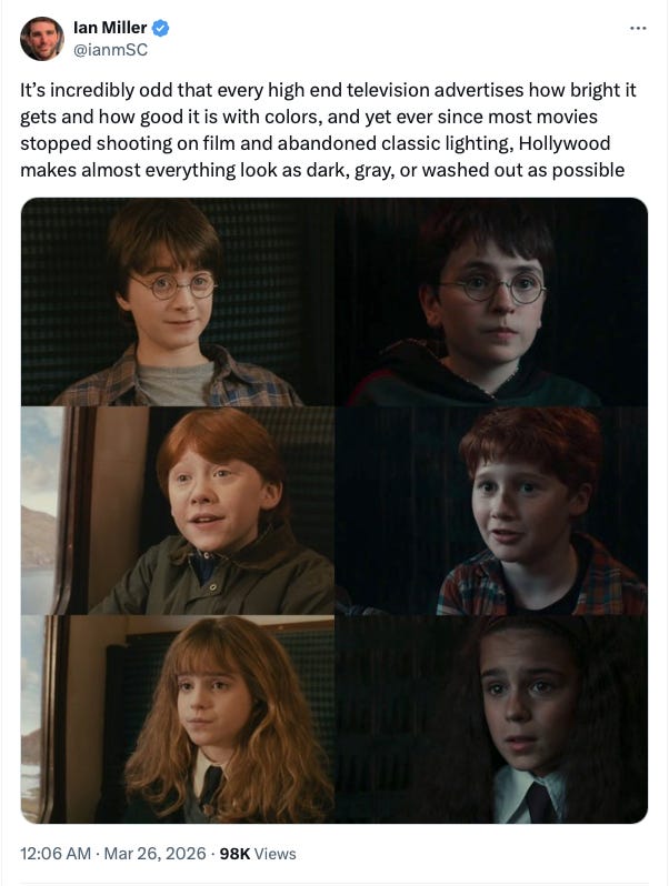
Did you see the reaction all over the internet last week when the new Harry Potter series trailer dropped?
Last week I talked about the Vision Gap and started the whole convo about how to close it and make sure your film is everything you imagined it could be. I’ll be sharing over the next couple of weeks templates you can use to share with your Editor, Colorist and Sound Mixer in order to close that gap. Today I’m starting with color because of the big reaction that came out about the Harry Potter Trailer. Next week I’ll share the editor breakdown.
The internet had thoughts. And it wasn’t even about the series. It was about how bland and desaturated everything looked compared to the original films. People were pulling up side-by-side comparisons, creating all kinds of reaction reels, and doing color analyses in the comments. While some of that was nostalgia talking (no it was not only millennials I’ve been told recently Harry Potter is “millennial cringe” to which I roll my eyes), a lot of it was pointing at something real. Something that has been quietly spreading across film and television for years now. Something the industry has mostly just... accepted.
I want to talk about why that happens. Because it is not just a taste issue. It is a systemic one. And once you understand the system, you can get out off that path and not fall into the same trap.
Here is what most people in this industry will not say directly
The grey, flat, washed-out look you keep seeing is not a stylistic choice. It is what happens when a project gets to the color bay and nobody has done the work of saying clearly what the images are supposed to do. This used to be largely influenced by the cinematographer or DP on a project but more and more I’m seeing that, that is not happening.
Let me explain where it starts.
When productions shot on film, the format had an enormous amount of dynamic range in the highlights. Highlights could hold detail that felt natural and luminous. When digital cameras came along, that highlight range was significantly lower, and so cinematographers started underexposing slightly to protect what they could. They also started shooting in log format, which is essentially a flat, low-contrast, desaturated recording mode that preserves as much information as possible before the grade. Log footage looks like nothing. It is grey and lifeless and intentionally so, because it is designed to be a starting point, not a finished image.
Here is the thing though. In the early days of digital, those cameras actually had less dynamic range than film. So the industry spent years chasing film’s latitude, developing cameras and log profiles specifically to close that gap. And we have now largely closed it. We have surpassed it in some cases. But the habits that were built around compensating for inferior capture technology did not disappear when the technology got better. They became the norm.
And then came what a lot of colorists and post supervisors I know call the Netflix effect.
The Netflix Effect
Netflix, to its enormous credit, set a very high technical bar for the content on its platform. Delivery specifications, quality control standards, approved facilities. They have a list of approved vendors, meaning colorists and post houses that have already been vetted and approved, and productions are strongly encouraged to use them. That is not a bad thing in isolation. The problem is what happens over time when the same colorists are grading show after show for the same platform with the same standards. A colorist who produced something bold and different on one show and had it approved is unlikely to push dramatically further on the next show. The risk is not worth it. So they stay in a range that they know will clear the gate. And the range narrows.
I want to be fair here because I have had genuinely wonderful collaborative experiences with Netflix. They are one of the more creatively supportive streamers I have worked with. But the effect is real, and it is not really anyone’s fault. It is what happens when quality standards get institutionalized in a way that, over time, quietly discourages creative risk.
The part that happens on your project, the part you can actually control.
Your director, your producer, your editor, and sometimes your executive producers are watching that log footage for months before it ever gets to a colorist. They are cutting with it. Reviewing it. Making decisions with it. Their eyes adjust. The grey, flat, offline version of your film starts to feel like the film. And then when a colorist sits down and actually tries to build a real grade, something with contrast and color and intention, it can feel like too much. Not because it is wrong. But because it is different from what everyone has been staring at for the last six months.
That is the grey trap. You get used to it. Your team gets used to it. And then you pull the colorist back toward the grey because the grade feels like a stranger.
This is exactly why the Harry Potter trailer looked the way it looked. It is not just about cinematography choices or directorial vision. It is about a pipeline that starts with flat footage, runs through months of offline editing where that flat footage becomes familiar, passes through a system of approved vendors with narrowing creative ranges, and then gets delivered to the color bay without a clear, written, scene-by-scene document that says: here is what this image is supposed to do, and here is what it must not become.
And this brings me to something I have been saying for a while now in rooms where people often look at me like I said something strange.
The tradition of handing your colorist a look book, a collection of reference images and film stills, and calling that a creative brief, is not a brief. It is a mood board. And mood boards are open to interpretation in a way that your film’s visual story and budget cannot afford.
Your colorist is extraordinary at what they do. They can look at a set of reference images and derive a direction from them. They can make educated guesses about what you want the first act to feel like versus the third. They can use their years of experience to build a grade that is technically beautiful and emotionally approximately right.
But approximately right is not the same as right. And in color, the distance between those two things is where your film’s story gets blurred.
Here is what I know from being inside the post-production process for 16 years. A colorist who receives a written scene-by-scene brief, one that tells them not just how you want the image to look - with examples - but what you need the image to do emotionally, can grade with a precision and intentionality that a look book alone will never unlock without them having to guess. Because color is actually a big part of the story. Every shadow, every highlight, every temperature shift is either telling your story or muddying it. And you don’t want to just be seeing power windows everywhere “reverse DP’ing” is not a thing, even though I’ve heard that term more than once.
What That Means For Your Film
Think about what that actually means for your film. The scene where your character is at their lowest point. What color temperature should the shadows carry? What is the saturation doing to the skin tone? Is the light falling harsh or soft, and does that choice reinforce the isolation the character is feeling, or does it accidentally soften a moment that needs to be hard? Those are not aesthetic decisions. They are narrative ones. And the colorist can only make them correctly if you have told them what the scene is supposed to be doing in the story. Most importantly take the time to think through this before you shoot so that you can already start with a base idea of what you’re going for.
That written brief is also your protection against the grey trap I described earlier. When everyone on your team has been living in the offline for six months and the colorist starts pushing the image somewhere actually interesting, you can pull out the document. You can say: this is what we decided this scene needed to do before any of us got used to the grey version.
I go through every scene with the filmmaker and we talk about the visual emotional intention, not just what it should look like, but what the color is supposed to make the audience feel, and how it connects to the scenes around it. Does this scene need to feel like relief after something relentless? Does the color palette shift here because the character’s world has permanently changed? Is there a moment where the light should feel like a lie, warm and inviting while something terrible is happening, because that visual irony is part of the story?
DI is one of my favorite parts of the finishing process because after all “photography” means painting with light, so really make that light work for you in this stage.
All of that goes into a true written color brief.
Here is a partial structure of what that looks like. For each scene or sequence, you document the emotional temperature of the scene and what the audience should feel. You document the color palette intention, whether that is warm, cool, desaturated, or hyper-real, and more importantly why. You document contrast notes, whether this scene should feel hard or soft and where the light lives. You document skin tone intention and how the grade should treat your lead character’s face in this moment. You document any deliberate color shifts from the preceding scene and the reason for them. You include reference images specific to this scene or sequence with written annotation explaining what you are pulling from them and why. And you document what the color should never do in this scene. The guardrails.
The colorists worth working with do not want to guess. They want the brief, they want the intention, and they want the creative trust to serve it with their craft. Give them that, and you are not just protecting your film from the grey trap. You are giving your colorist permission to actually do what they are capable of.
The full Color Scene Intention template is available to download below. Bring it to your next color session. It will change the conversation from “does this look right to you?” to “here is exactly what this needs to do and here is how we get there together.”
I didn’t even get into the music part of the HP trailer which is a whole other side quest. But I’m hoping the music was just canned music for the trailer and the actual series will have some more identifiable pieces in it. I love a good soundtrack album.
Let’s talk notes from post.
Until next time,
Shawna Carroll
📌PS - If you found this post helpful, would you please consider restocking it and sharing it with fellow filmmakers?
This spreads the word and keeps me writing about how you can get your film to the finish line and build a sustainable film career 🙏
Great article so much I can relate to even come a post production sound perspective